

My Role
UX/ UI design, UX researcher, Branding
Time
2 months
From July 2021 to September 2021
Programs and tools
Adobe XD, Figma, Adobe Illustrator, Paint, Procreate, Marvel, Invision, Miro,
The problem
Iraq is now going through a prosperous period where there is an increase in tourism for cultural, natural, historical purposes. The airways are going through the expansion of its fleet. However, the airline has a serious problem with the user experience when it comes to its application.
Why fixing the app of the airline is the key?
Keynotes
Most of the local users tend to not use the mobile app to book flights for reasons that the fare of flights is not available for them online since the website and the app is hardly functional.
Another reason is that the users plan their trips more casually. Their process consists of going to booking agents’ offices, asking for available trips, and seeing the rates.
The disadvantage for the local users:
-
Not being able to know the fairs of the flights ahead of time.
-
The hardship of going out physically to book.
-
Lack of knowledge of the availability of the trips on a certain date.

The Solution
-
Reconstruing the digital design of the service the airline provides via mobile phones and creating a service that fits the needs of the local and the international travelers by researching the nature of the travelers.
-
Creating a new image of the airline that reflects the changes as a high-quality dependable service of air travel.
The competitive analysis
What do other services of this kind in the region look like?
This study is important to understand the market in the region and have an idea of the potential competition. It could show us what elements are working and which that are not so successful. it defines the elements of the success or the weaknesses of other providers of aviation service.

Screener Survey and interview process
The interview process: Why the process is so difficult ???
The research found that 70 % of the travelers on the Iraqi airline are in fact international thus 3 of the interviewee must be international travelers.
Five users were interviewed with different levels of experience
Example of the questions:
-
Why do you prefer one medium of booking a flight over the other?
-
What are the general struggles you face when booking a flight?
-
Which airline that you flew with that you are satisfied with their service? why?
-
What feature is a must-have in an airline application?
-
What are some of the frustrations that you face when booking a flight using an App?
.png)
" The process is stressful and often not that clear."
-Patrick-
"It is nice when the app tells me the information that I need to know without complexity."
-Esh-

Sticky notes
The interviewees spoke their mind
It's important to note that there were no key differences between the local Iraqi travelers and the international travelers as far as frustration and needs


The goal is to keep it easy, rich in the necessary information, and trustworthy
Meet Lu
Meet Sara
Creating the personas
We need a face for the users!
We need to have personalities that reflect the needs of the users. The process is meant to collect all the data gathered from the interviews to create a character of these needs depending on how stratified the needs of the users are. In this case, all the Iraqi and the international users were very similar in showing key points. The key points were following two patterns. For that reason, I have Lu and Sara to represent the travelers and their needs.
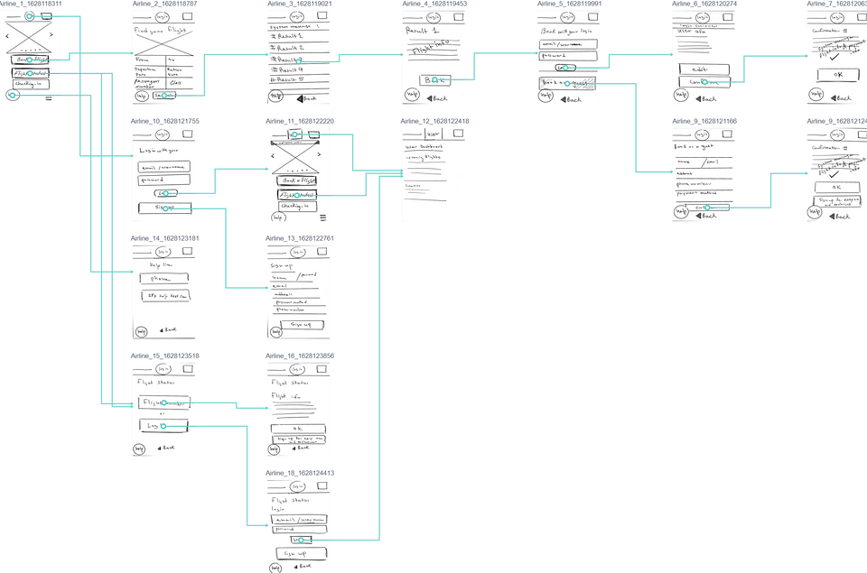
User flow
We want an easy and informative user experience

General User flow chart
Flow of booking a flight
Flow of checking flight information
.png)
.png)
MVP of the app

The design
How to utilize all of the information above
Keep it simple and direct!
After sketching and sketching playing with different concepts, I settled on a straightforward design that is slightly promotional after getting a 12 out of 15 votes for this design


Why does it look like that?
After collecting enough information, hearing out the users from different demographics, and taking into consideration the nature of the service provided by the other regional airline, I decided on having the easy-to-use app with direct commands to eliminate confusion and anxiety. In addition, I wanted some promotional material that will not be overlining to the users.
The wireframe usability test
Now, its time to test the wireframes
a simple design was created to test the user journey. It was important to me to catch any design issue in the user flow before going on the design phase. all of the usability tests were accomplished with at least five users.
Take a look using the link below :)
https://marvelapp.com/prototype/8a07d6g/screens?sign_up_origin=player
Notes from the wireframe test
It's working but nothing special
The early design worked well for the users to perform the basic commands like booking a flight or checking the flight status; however, the app needed features to fit the need of today's travelers local (Iraqi) and international, and to make this app a positively unique experience. after this usability test, it was time to create a more mature design.
The low fidelity wireframe
Focus on the user journey
I created this prototype using Abobe XD with having in mind keeping the lowest number of pages to complete the booking process. This is the seat of solidifying the vision of the app. I mean by including all the features and the notes that would work for the users from the research.
You can take a look at the first prototype using the link below :)
https://akram258969.invisionapp.com/console/share/XQ2YOW63NF

Features of the initial prototype
What makes this app different in design?
During the design phase, a lot of features were included in the design. The reason for having those tools was to create a tailored experience for today's users. Certain goals were needed to be met are listed below:
-
Info-rich with minimal effort
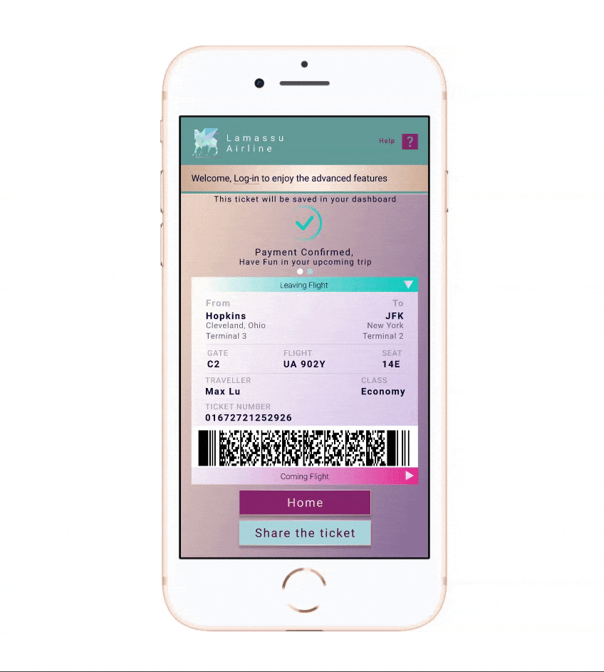
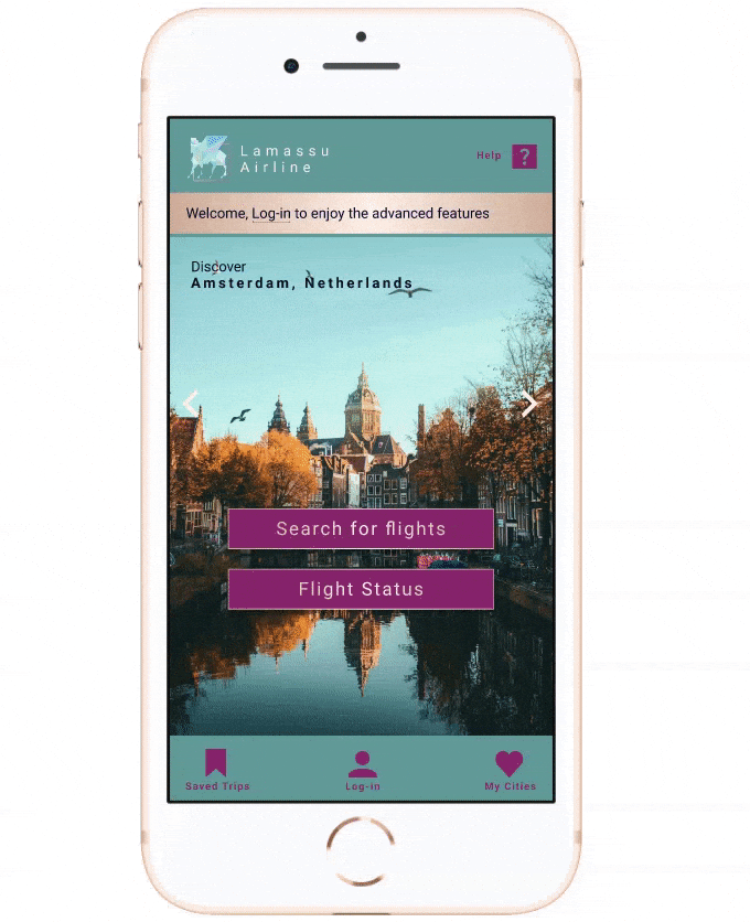
Information banner

Right on the home page, the user will be greeted by a banner that contains all the necessary information like airline aviation notes and or costume user notification. This addition to the design was made to inform the users of any necessary information.
Information about previous steps

During the users' journey. The users are constantly informed about the information carried out by their actions. this would lower their anxiety and keep them moving forward in the process rather than going back to double-check
Flight information

One of the major concerns of the users was luggage information. they expressed that sometimes it's easy to miss or hard to find. Here, the language information was presented in each flight. also, the style gives many keys of the time of the flight like day or night day by an icon of the sun or moon which make it easy for users who are selective of their time of the day to travel. Part of the style is the highlight of the lowest price or deal. another information that is presented which was major information for some travelers is the type of aircraft. all these informational keys are presented minimally in a spot where the users do not have to think or move forward to know this information to make the session, making a fewer time decision and a better overall experience.
-
Saving features
Save a flight for later

Saving a trip is an important feature for many travelers based on my research. The saved trip will be easy to access on the bottom navigation. In the final design and the second prototype, the saved flights will be accessed directly from the bottom menu while in the first design in would be accessed via the hamburger menu then the saved flights' section.
Save a destination

It is also a feature that many international travelers would love to use and have on their airline apps. I decided to open the scope of saving a flight to favoriting a destination where the users can check for flights directly to that destination without having to go for a search or get notifications when a certain flight is on sale for their favorite cities. In the first design, the function was done through a separate page, but by noticing the users, I realized it was more time-consuming. In the second prototype, the action was more successful but, it did not follow the design guidelines. The final design was successful and practical. The users will see all the cities they favorite
Incorporating these two features would encourage the users to sign up with the airline to get the benefit of them.
The mood board
Lets Get Inspired!

What are the criteria?
The design and the colors must reflect high-quality service, Trust, and Rich History
Design Guide
the design guide went through different changes because of the goal of having colors reflecting high-quality work and a strong image.
Users have been asked during the usability test about the colors and what image it reflects and changes were made based on their reactions because this project was not about the user experience, but in addition, it was meant to improve and create a new greater image for the airline

The final prototype breakdown
Many changes multiple usability tests
After each prototype I created, the prototype was tested with a group that is diverse to get to the desired image and the service of the airline. Even the design guide was changed heavily because I was insisting on giving the impression of the high quality of the airline.
Added elements
In addition to all the improvements in design to the newest version, many elements were added to the final design to create a complete prototype and improve the overall experience.
In an action like asking for help where it branches to two choices, the background is illuminated by blur to keep the focus of the user on the task at hand. This is important to account for the new users that are easily intimidated or distracted.
Isolation of the action
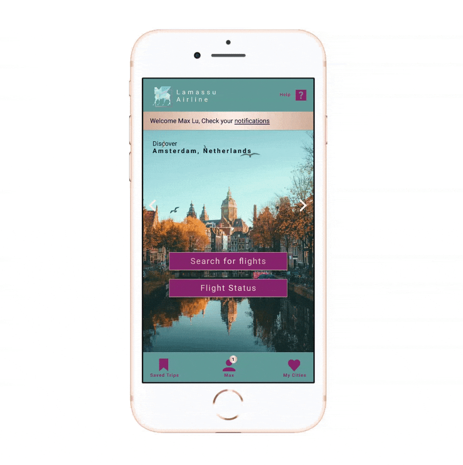
Easy Share
This would allow the users to share their tickets with their family or friends especially if they are buying a flight ticket for more than one person.

Landing page
The final design has a landing page with simple animation added to the app to promote a positive image of the airline. The landing page would have the possibility of choosing a language of preference for the app. Also, it provides the space to introduce the features or any feature promotion to the customers before landing the app. The new version of the app has a simple loading animation to improve the user experience.
Easy log in
Users with the latest version have the ability to log in and sign up with their social media account
Change in functionality
in addition to the change to the color palette, the buttons and the functions were made bigger to make it easy to tap. The cancel button was removed to avoid canceling by mistake. instead, the cancelation was moved to the upper right corner and the cancelation could be performed by the swipe gesture. The bottom menu was provided unnecessarily and the home bottom was causing a cancellation of the process so it was removed.

Cleaner look
The style changed to be more engaging, and more elegant. The colors and the size of the action buttons changed to create more emphasis. The hamburger menu was eliminated to create a more focused feel. After the usability test, I found that the home button was not necessary especially it could cause an accidental cancelation.

Minimal actions
The cancellation button was removed to eliminate accidental cancelation, and cancellation of the tap was added on top. The top actions were made more pronounced. Favoriting a city action was made bigger to follow the guideline and make it more noticeable. At the bottom, I tried to eliminate the clutter of actions to take on each page and make the process as short as possible. For each page in the booking process, their almost one action to take to move forward, and their actions are indicated by one strong wine color.

Visual aid
At the top, progress indicator as a dark shade was added that increase from leaft to right with each step forward. A leaving or coming flight indicator was added. The lowest price will appear highlighted and marked with ( Best deal) to make it easy to regogize. Sun or moon was added to the flight info to give a quick indicator if the flight is the day or at night. The info of the luggage is more detailed with weight and dimensions of the bags.
How do you measure success?
In the last usability test, the app was described by the users as easy to use, elegant and induced positive imagery, rich in information without intimidation, and very user friendly
The users completed all the tasks with a 5/5 success rate
Feel free to check out the Figma file :)
https://www.figma.com/file/fvtjeSi0Q0Pmj9Km2bWbET/Lamassu-Airline-experiment-(Copy)?node-id=0%3A1
