My Role
UX/ UI design, UX researcher and illustrator
Time
Design Sprint in 5 days
Programs and tools
Figma, Invision, Adobe photoshop, Miro, Adobe Illustrator, Paint, Procreate,
The problem:
GramCity provided is a photo editing app. They provided with the challenge to design a feature that would allow users to find places that are neat, cool, and artsy to take pictures to post on Instagram or other social media platforms.
The constraints of the project are:
-
GramCity wants to help users find physical places and locations.
-
GramCity wants to create an active community of users who find and share their favorite locations.
Getting the information
What are the viewpoints of the potential users?
These are the insights of fictional users providing a view of how they find places they like and what they do to find them
How do you find a cool new place to take a photo?

Personas
The users follow two distinct patterns.
Let's meet Sarah and Nick! the users either follow Sarah or Nick in their approach in finding places to take pictures of


Day 1
How are the users find places?
The first day was about understanding the challenge and mapping out the potential solutions.
The first step of the research process is to think about the keywords throughout the process. I wrote down the most repeated words by the users like community, nice places, art, architecture, attractions, planned visit, places around me, hidden gem, and share. Writing down the phrases will keep the focus on the mission and avoid deviations during the fast pace work process. While Keeping the words in mind, the next step was to give the project a name that represented its functionality.
I chose the word Discover for this feature because I want it to be easily recognizable and understand its purpose.
I made a simple map of how the product would deliver to the users' needs.
General User journey

User Journey of Sarah and Nick

The Discover feature will have two major user maps, Users like Nick, who are looking for places around them would:
-
Open the app when they want to find a hidden gem near them and press the Discover button.
-
The feature would show them a bunch of options of places near them
-
The users would pick the one that matches what they are looking for.
-
The app would help them navigate to that place or launch a navigation app.
-
The users will take a picture using Gram City and post it on Instagram. They can rate and share their opinion about the place.
The other user map is for people like Sarah, who are searching for places in a specific city to create a list would:
-
Open the Gram City app and use the feature
-
They would search for the city that they want to discover its places.
-
They can add the places to a list of that specific city.
-
The list will be saved to their account for that specific city.
Lightning Demo
To get a perspective on the feature of discovering new places. Below are the best examples that tackle a similar challenge of finding and searching for different things as a goal. They help the users by presenting various options, depending on their service, and or helping the users find what they want.
1. Google maps & Yelp: Map display

Google Maps and Yelp solve a similar challenge because they help users discover places. They both choose to display a map with pins representing the places around the user. They show the picked place as a small box with a minimal important set of information like rating or collection of pictures in the case of google maps. Google Maps has the option of navigating to the place or saving it. In addition, they both have a search bar on the top with filters to help the users find a specific place.
2. Airbnb: One simple tool

Airbnb has a different approach to displaying places for the users. The list display is very successful at isolating the result. The search results will have a bigger space for pictures and to present the information.
The most important point about the Airbnb service is utilizing the rating system as the core of the service. The app understands the users are looking for accommodations, and for that, the rating would have a greater value since staying at another person's place is a sensitive matter. That's why the users will depend on people who have visited the location to get their options. Airbnb clearly understands that. For that reason, they have the rating clear under every search result and made it so easy to use and review. The way that Airbnb based its solution on the rating system is a perfect example of how a service should utilize a tool to make it a backbone for the service it is trying to provide.
3. Waze: The addition button

This app is an effective navigation app that shows different places while you are on your path.
The floating action button is a great tool that contains more than one quick action. With one tap on, the users can report any issue on their route to warn other drivers on the same road. By adding this tool, this app distinguished itself from other navigation apps. Just like Airbnb, they used a simple tool to provide a solution for a common problem by making the users themselves the providers of the service. I can see this interactive service as one of the solutions for the GramCity feature.
Day 2
The start of the design
I used the crazy 8's method. 8 potential solutions were made in 8 minutes giving a minute for each sketch.
Crazy 8's designs

Round one of the elimination process
Round one of the elimination process

Round two of the elimination process

At the end of the crazy 8 processes, the designs went through rounds of eliminations. Each design was analyzed based on their user-friendly, innovation, and fitting the goal of the project.
After two rounds of elimination, two designs were chosen to serve as the basis of the service.
The first idea of the design

The next step was drawing the main three screens of the app based on the chosen design created earlier. As a easy filters I used three place categories : Attraction, Art and architecture.
Day 3
The Design is getting clearer
The goal of day three of the design sprint was to create more elaborated pages of the proposed design that fits each persona. The first persona, Nick, needs to discover places around him without having to search. Sarah likes to plan her trip and the locations to visit. Based on this information, I created two red routes that fit the needs of these two types of users
This is the journey of Nick, a casual type of user

This is the journey of Sarah, a planner type of user

Day 4
It is time to put everything together !
On day four, I made the first prototype. The purpose of this prototype is for the users to test it. The users were contacted on day one of the design sprinit to prepare them. The prototype had the initial components for the design to be tested.

I designed the prototype to help users find places near them or cities that they might visit. I want it to make a design that reflects the needs of both types of users. My goal was to make the prototype as easy to use as possible and for the users to learn as little as possible to start using the Discover feature most efficiently. The general theme of the tool is to give the users the ability to add places that they think it is worthy of being on the platform. Also, the users will be able to add a comment and rate to the location after taking a picture to help other users have a better idea of the location. The screens represent the user journey of two types of users.
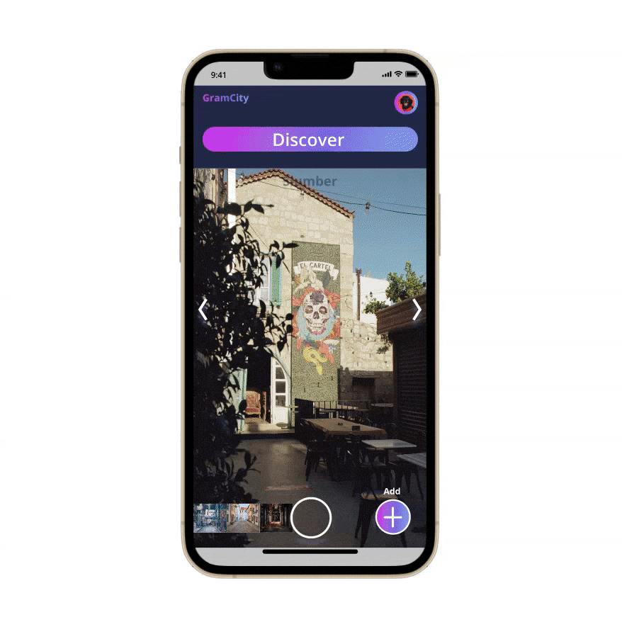
The first page on the top left is the home page of GramCity, with the camera being ready to use. The discover tool is used by pressing the Discover button on the GramCity main page.

Day 5
The usability test
What did I learn from the users?
The last day of the sprint was dedicated to the usability test. All of the participants are Instagram users, and they post on the platform on regular basis.
The first scenario is the user is trying to find a place near them of a mural, navigating to it then taking a picture.
The second scenario is when the user is looking for places to visit in a city. after analyzing all of the inputs from the users from the design sprint simple iteration was done to the prototype to create a more mature design that takes into consideration the notes of the users.
-
All of the users thought that the app is easy to use and very simple.
-
All of the actions were completed successfully. However, one user had an issue with not being able to see the places in a list form on the map page.
-
One user was favoring having the add button on the main page because they might not add a place on the map page since the user is concerned about finding a place rather than doing more than one action.
-
Users pointed out the lack of a cancellation button in the case they do not like the place or the picture or in a case that they change their mind about the place.
-
Users pointed out the potential to share their results or the places with other people.
-
Another issue is the ability to see the place in a more immersive way with more than one picture to see.

The iterations to the initial prototype
Alternation of display with gestures

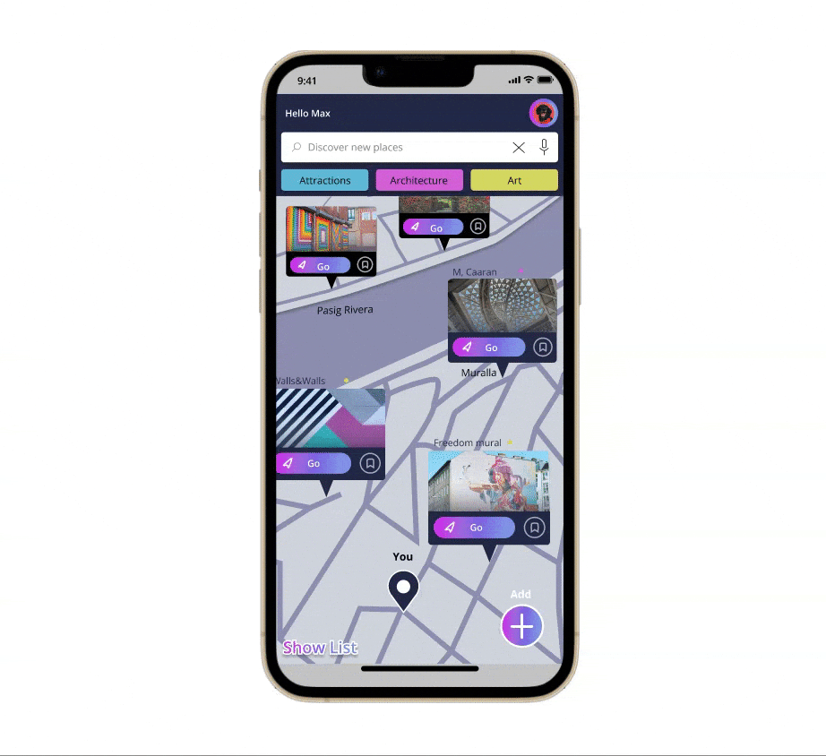
Implementing the use of the gesture method to navigate through the tool. I added the option for the users to see the results of the map in a list form to allow them to switch back and forth between the different methods of display depending on the user. Users can swipe up to show the results in a list form or use the button ( Show List). The users can swipe down to go back to the map form.
The final look of the Discover feature

User finding a place around them: The final look of Nick's Journey

User finding places in a specific city: Sarah's Journey